Pantone Fall/Winter 2016
FALL 2016: A Unity of Strength, Confidence and Complexity
The desire for tranquility, strength, and optimism have inspired a Fall 2016 color palette that is led by the Blue family.
Along with anchoring earth tones, exuberant pops of vibrant colors also appear throughout the collections. Transcending gender, these unexpectedly vivacious colors in our Fall 2016 palette act as playful but structured departures from your more typical fall shades.
Blue skies represent constancy as they are always above us. Grays give a feeling of stability, Red tones invite confidence and warmth, while the hot Pinkish Purples and Spicy Mustard Yellows suggest a touch of the exotic.
Leatrice EisemanExecutive Director of the Pantone Color Institute™
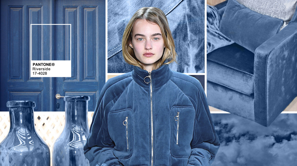
RIVERSIDE
Earmarking the importance of Blue in the palette, the new blue shade of PANTONE 17-4028
Riverside undeniably takes precedence in the fall collections.
- Cool and calming, strong and stable
- Displays a subtle vibrancy and sophistication
- Borders on exciting, yet
- Maintains a sense of constancy
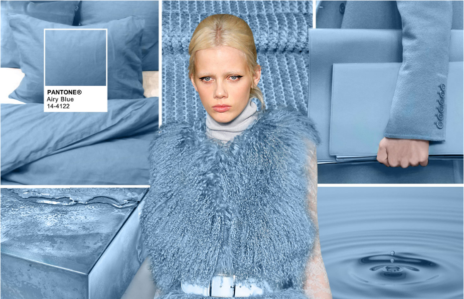
AIRY BLUE
Pantone 14-4122
Airy Blue’s lofty nature evokes feelings of lightness and freedom.
- Designers seeking weightlessness in a world heavy with conflict
- Blue tones appear in nearly half of the designs
- Airy Blue nods to Serenity
- Pair Airy Blue with Lush Meadow, Taupe or Dusty Cedar for fresh approach
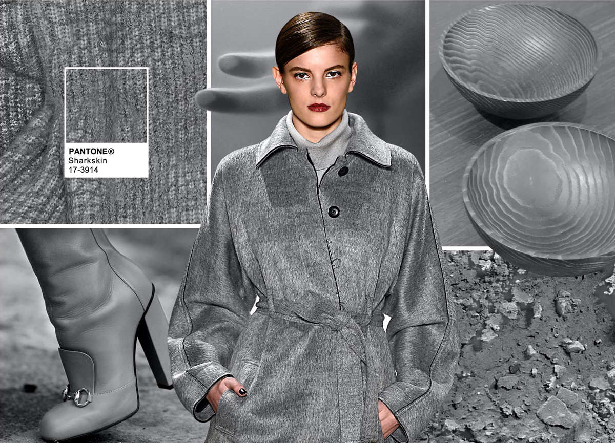
SHARKSKIN
There’s an edge to PANTONE 17-3914 Sharkskin,
and yet it manages to remain neutral.
- Pair-able with almost any fall color, bright or muted
- A color that the rest of the palette can literally and theoretically rest on
- Showcases practicality through a dependable but contemporary lens
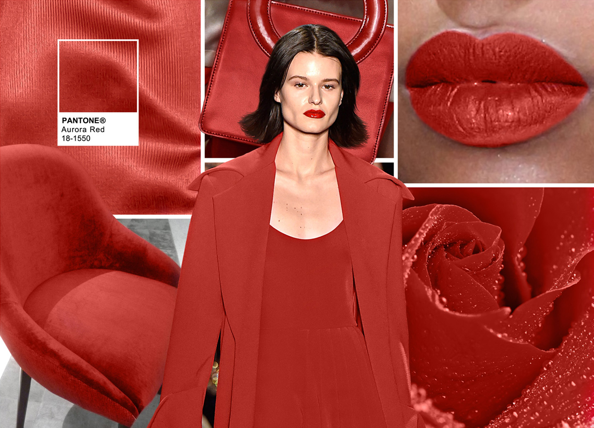
AURORA RED
In contrast to the stable backbone of the Fall 2016 palette,
PANTONE 18-1550
Aurora Red adds a welcome punch.
- A bold Red that is warm, sensual and immediately pleasing to the eye
- Gets the metaphorical blood of the palette pumping
- Exciting and dynamic, breeds unmistakable confidence
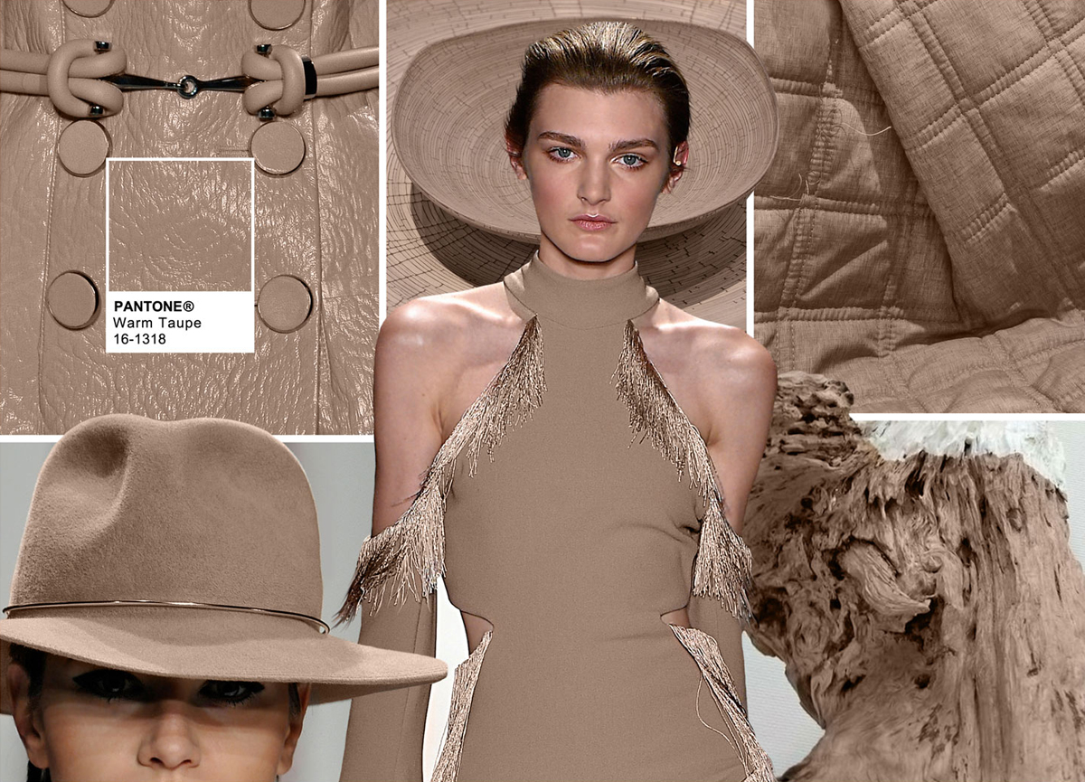
WARM TAUPE
PANTONE 16-1318
Warm Taupe is a hearty, pleasing and approachable neutral that pairs well with each of the top 10 shades of the Fall 2016 season.
- Suggests reassurance and stability
- Trusted, organic and grounded
- Departs slightly from the foundations of the Fall 2016 palette
- Timeless
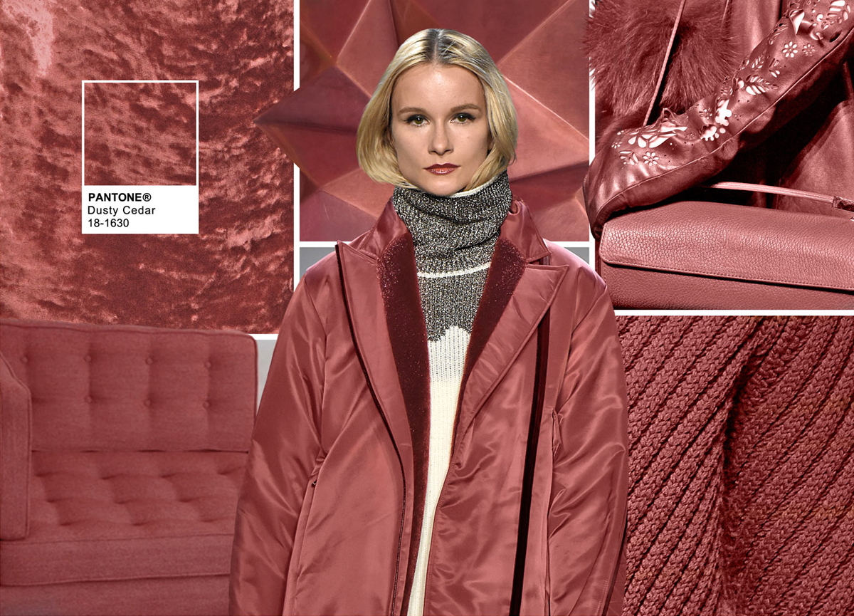
DUSTY CEDAR
Like Airy Blue, PANTONE 18-1630
Dusty Cedar gives a nod to the PANTONE Color of the Year 2016,Rose Quartz.
- A fall and winter version of the Pinks we’re used to seeing in spring
- Dustier rose-toned Pink shade with some complexity
- Exudes warmth and welcome
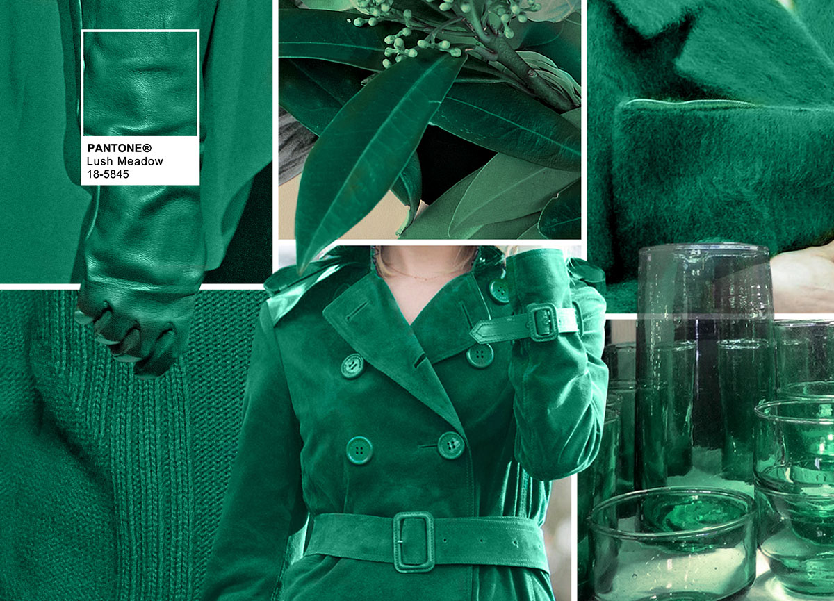
LUSH MEADOW
PANTONE 18-5845
Lush Meadow brings to mind fresh botanicals and foliage.
- Rich and elegant, vibrant and sophisticated
- This shade displays a brightness, panache and depth of color that elevates it from more natural greens
- Elevates the overall elegance woven through this season’s collections
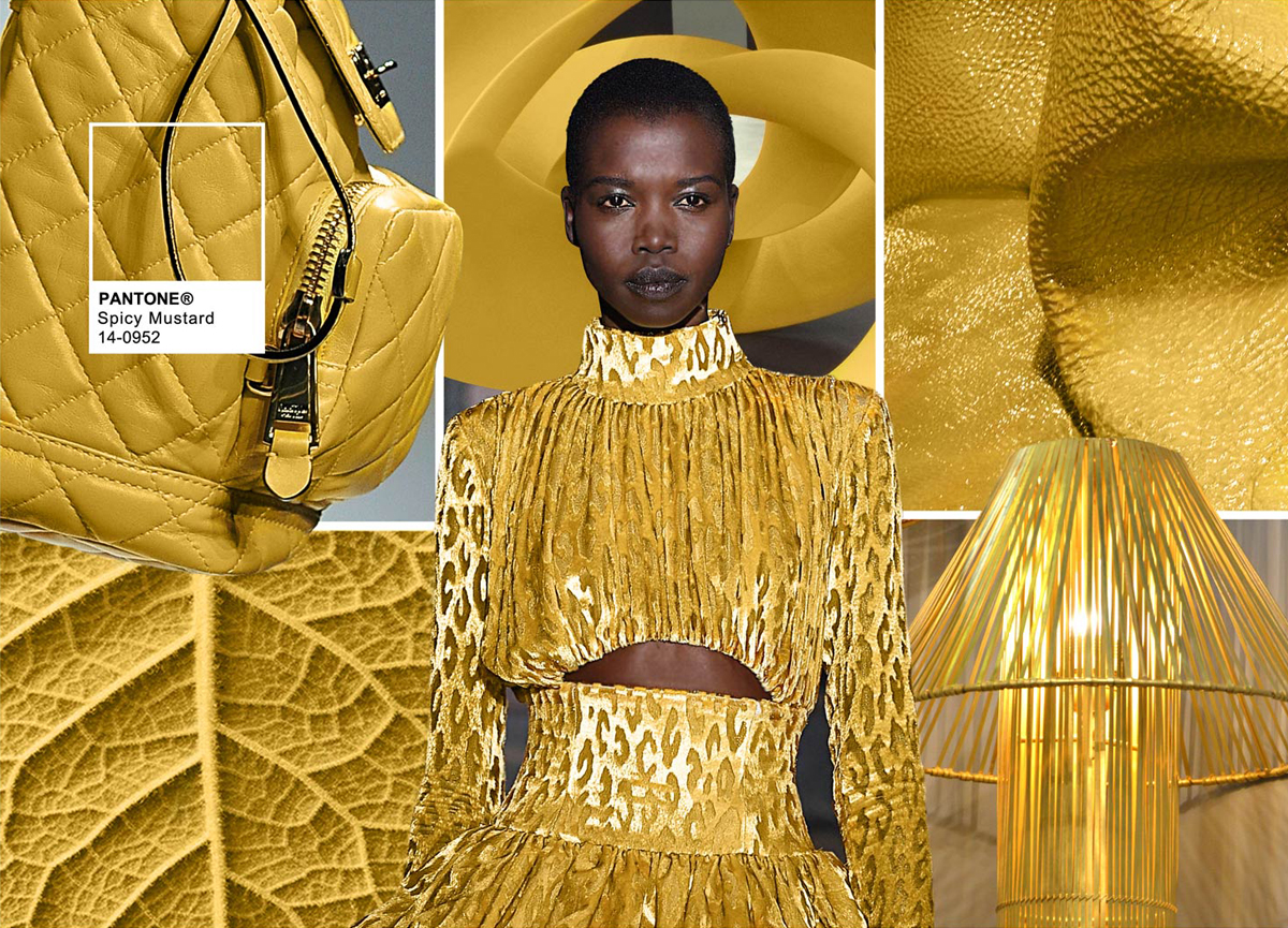
SPICY MUSTARD
Bounces elegantly off other colors in the palette,
PANTONE 14-0952 Spicy Mustard is an exotic addition.
- Adds another splash of uplifting vibrancy
- A spicier, zestier Yellow than previous seasons
- Unexpected and unusual
- Comes through in both the abstract and geometric accents that designers employed
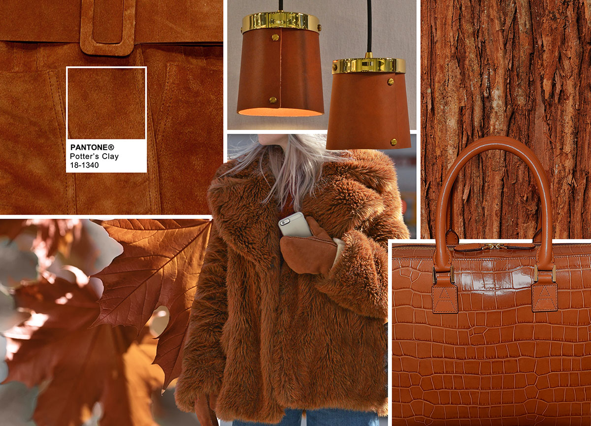
POTTER’S CLAY
PANTONE 18-1340
Potter’s Clay has an added degree of sophistication and layering.
- Elements of russet Orange in its undertones, gives a grounded feeling that’s anything but flat
- Neutral earth tone; expected for fall and winter palette
- A shade with real substance; a strong foundation
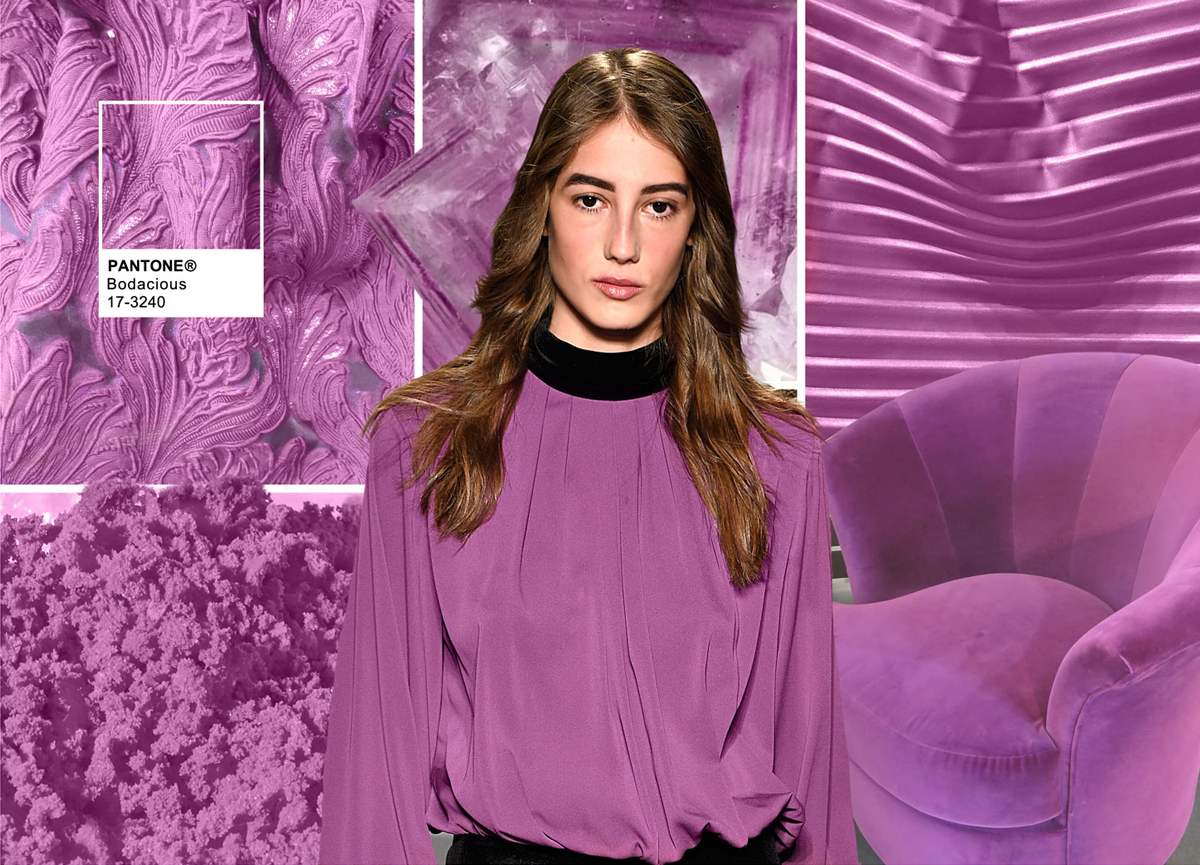
BODACIOUS
PANTONE 17-3240
Bodacious speaks to the gender fluidity we continue to see.
- Lends itself to vibrant color combinations
- Unexpected in fall
- Versatile; can be used with Pinks and Reds
- Bright, rich Purple, with hints of a more sophisticated Pink
- Turns fashion accents into fashion statements


